asset-class-risk-vs-return-scatterplots
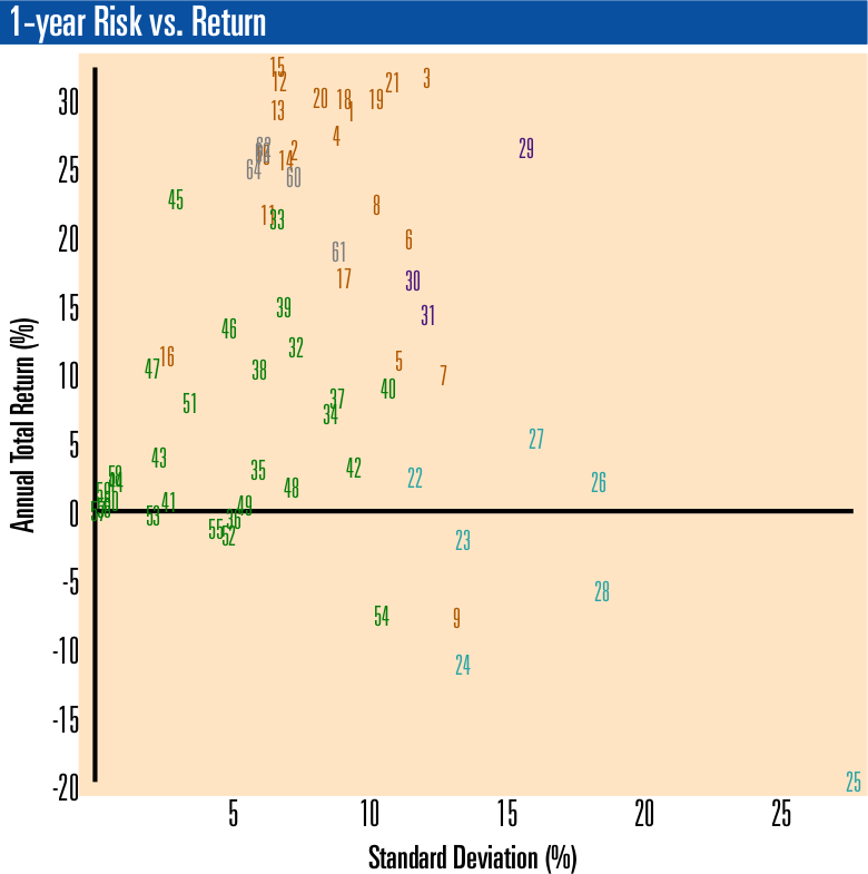
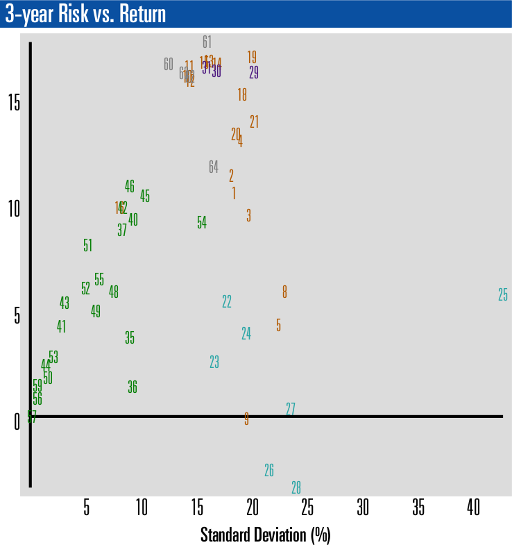
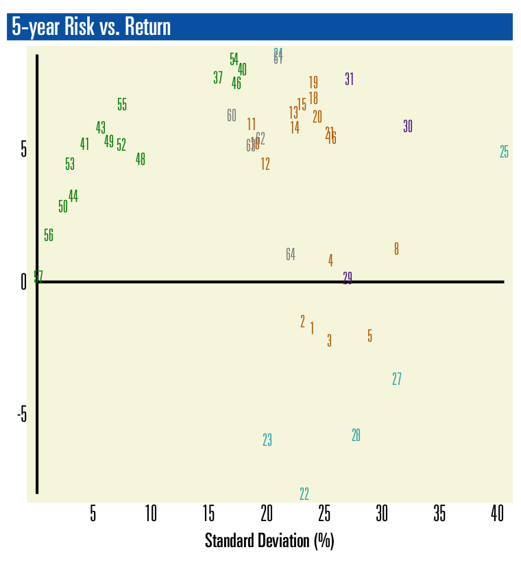
The charts below display Risk vs. Return for a list of 59 global asset classes and 5 benchmarks. Each asset class is represented by an ETF proxy. The ETF ticker are located in the number list below the charts.
The Risk vs. Return Scatterplot chart allows you to compare all portfolios in one view using total return and standard deviation. Each portfolio on the report is given a number that appears in the left column of the page. This number is plotted on the scatterplot. The vertical axis (Y-axis) is the total return for a specified period (1, 3, or 5 years) and the horizontal access (X-axis) is the standard deviation of the individual portfolios over the same period (1, 3, or 5 years).
Disclaimer
This report is provided “as is” for informational purposes only and is not intended for trading purposes or advice. Please consult a financial advisor for advice on your specific situation. Neither VizMetrics nor any of its information providers is liable for errors, omissions, or for any actions taken based on this information. This report is subject to the VizMetrics Terms of Service.
Data sources
Barchart.com Inc., U.S. Federal Reserve, VizMetrics analysis
Get More Portfolio Recipes
Get FREE, instant access to 275+ Portfolio Recipes, including tactical, strategic, do-it-yourself, and managed. Find low risk, high return Portfolio Recipes using full analytics (Performance, Risk vs. Return, Risk) for each individual Portfolio Recipe. Compare all Portfolio Recipes head-to-head using risk vs. return scatterplots. Compare 100+ asset class ETFs with results over 1, 3, 5, 7, and 10-year periods.