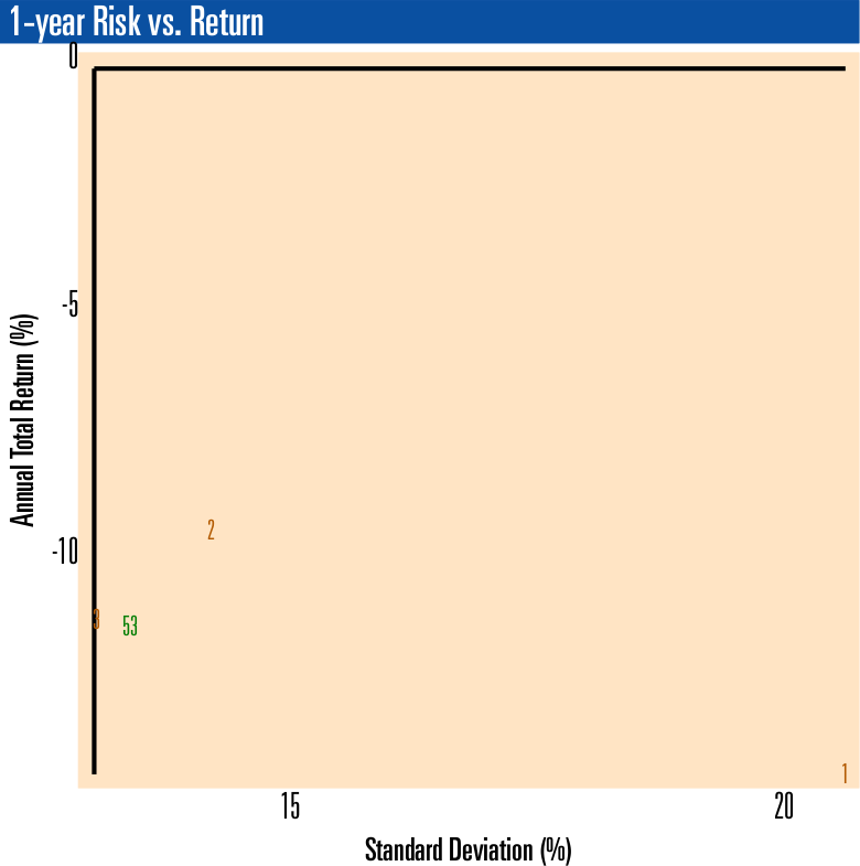
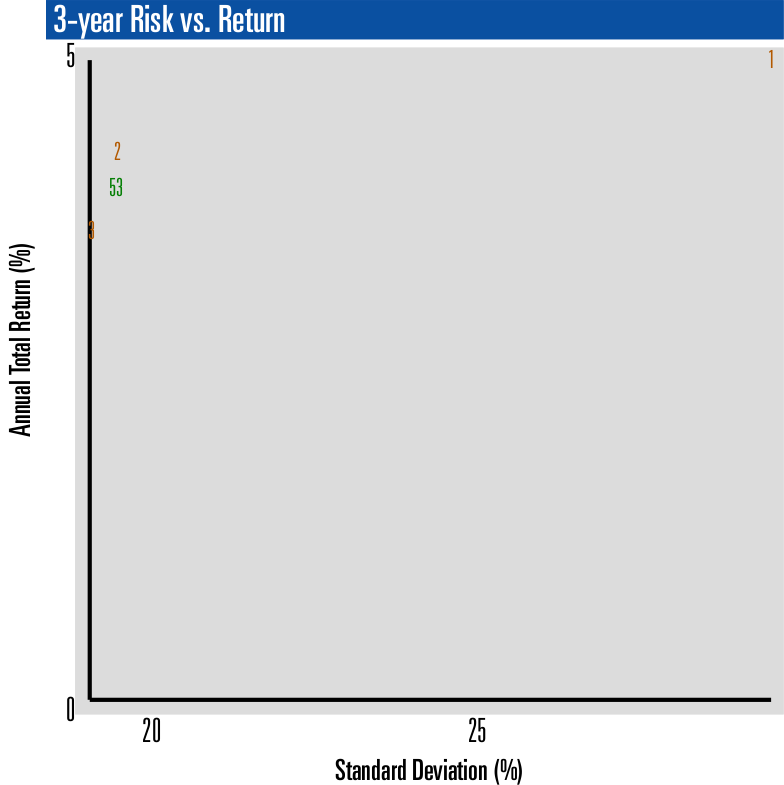
gold-funds-risk-vs-return-scatterplot
The charts below displays Risk vs. Return for three gold-related closed-end funds (CEF, GTU, PHYS) plus one ETF (GLD).
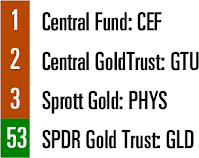
This chart is an excerpt from our full comparison of 63 gold and precious metals funds. Each fund is represented on the charts below by an id number, as follows:
These risk vs. return scatterplot charts allows you to compare the portfolios using total return and standard deviation. The vertical axis (Y-axis) is the total return for a specified period (1, 3, or 5 years) and the horizontal access (X-axis) is the standard deviation of the individual portfolios over the same period (1, 3, or 5 years).
Note that since the scaling is determined by the largest and smallest values on the chart, some items may be plotted on top of the Y-axis line. Also, the minimum value for the X-axis is not zero.
Get More Portfolio Recipes
Get FREE, instant access to 275+ Portfolio Recipes, including tactical, strategic, do-it-yourself, and managed. Find low risk, high return Portfolio Recipes using full analytics (Performance, Risk vs. Return, Risk) for each individual Portfolio Recipe. Compare all Portfolio Recipes head-to-head using risk vs. return scatterplots. Compare 100+ asset class ETFs with results over 1, 3, 5, 7, and 10-year periods.